
HSL Color Model: A Modern Tool for Color
HSL stands for "Hue, Saturation, Lightness." It describes color in a way that aligns more closely with human visual perception, making the color adjustment process more intuitive and efficient.
HSL代表“色相、饱和度、明度”。它以一种更符合人类视觉感知的方式描述颜色,使得调色过程更加直观和高效。
Compared to the traditional RGB model, the greatest advantages of HSL are its intuitiveness and operability. In RGB, adjusting a color's brightness or vibrancy requires modifying the values of the red, green, and blue channels simultaneously, a process that is complex and difficult to predict. In contrast, HSL separates the three dimensions of color, allowing users to adjust hue, saturation, or lightness individually without worrying about unintentionally altering other attributes.
与传统的RGB模型相比,HSL最大的优势在于其直观性和可操作性。在RGB中,调整颜色的明暗或鲜艳度需要同时修改红、绿、蓝三个通道的数值,这个过程复杂且不易预测。而HSL将颜色的三个维度独立开来,用户可以单独调节色相、饱和度或明度,无需担心其他属性被意外改变。
Basic Components of HSL
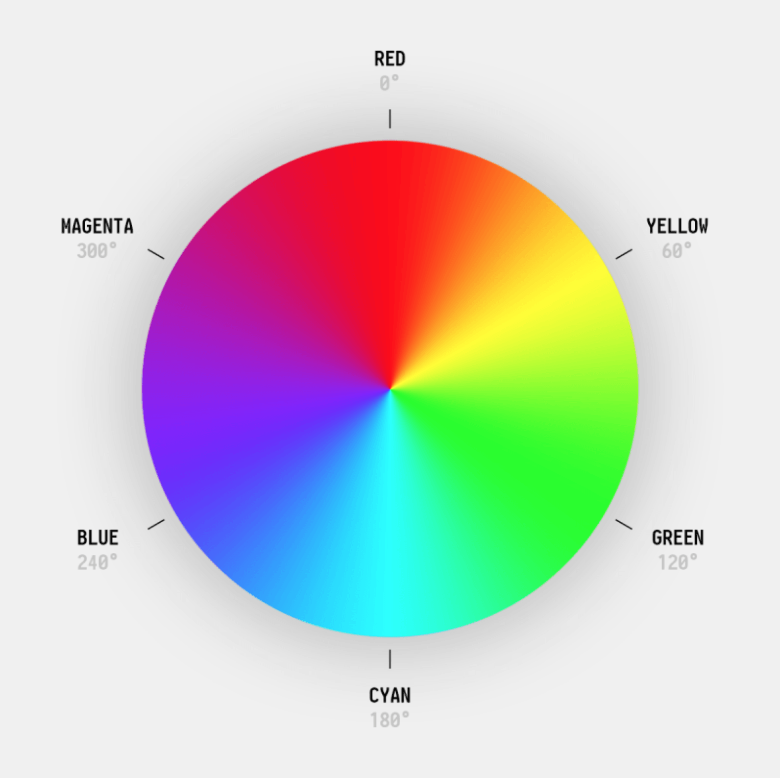
Hue (H): Represents the type of color, such as red, orange, yellow, green, blue, purple, etc. Hue is represented as an angle, ranging from 0° to 360°, based on the concept of the color wheel.
色相 (H): 表示颜色的种类,如红、橙、黄、绿、蓝、紫等。色相基于色轮的概念,用角度表示,取值范围为0°到360°。
Common hue angles include: 0° (or 360°) for Red, 60° for Yellow, 120° for Green, 180° for Cyan, 240° for Blue, and 300° for Magenta. For example, H=0° is pure red, H=120° is pure green, and H=240° is pure blue. Hue is cyclical, meaning 0° and 360° represent the same color (red).
常见的色相角度包括:红色 0° (或 360°),黄色 60°,绿色 120°,青色 180°,蓝色 240°,洋红/品红 300°。例如,H=0° 是纯红色,H=120° 是纯绿色,H=240° 是纯蓝色。色相是循环的,0° 和 360° 表示同一种颜色(红色)。
Saturation (S): Indicates the purity or intensity of a color, ranging from 0% to 100%. A higher value means a more vivid color; a lower value makes the color more grayish.
饱和度 (S): 表示颜色的纯度或鲜艳程度,取值范围为0%到100%。数值越高,颜色越鲜艳;数值越低,颜色越灰。
At 100% saturation, the color is fully saturated and most vibrant. At 50% saturation, it's a standard pure color. At 0% saturation, the color becomes a shade of gray, regardless of the original hue. For instance, S=100% red is vivid red, while S=0% turns it to gray. Note: When saturation is 0%, the color is always gray, regardless of hue. Lightness can still control how dark or light that gray is.
饱和度100%表示颜色完全饱和,最纯净、最鲜艳。饱和度50%是标准的纯色。饱和度0%表示完全去饱和,变成灰色(无论原色相是多少)。例如,S=100% 的红色是鲜红色,S=0% 则变为灰色。注意:当饱和度为0%时,无论色相是多少,颜色都是灰色。在HSL模型中,即使饱和度低,明度仍可控制灰色的深浅。
Lightness (L): Represents the perceived brightness of a color, defined as the midpoint between black and white. It is symmetrical: 0% is pure black, 100% is pure white, and 50% represents the standard, pure color.
明度 (L): 更科学地表示颜色的明暗程度,是从黑到白的中间点。它是对称的:0% 是纯黑,100% 是纯白,50% 是标准的纯色。
Key characteristics: L=0% results in black. L=50% with S=100% yields the purest form of the hue. L=100% results in white, regardless of hue or saturation. When L is 0% or 100%, saturation becomes ineffective (the result is always black or white). For example, HSL(0°, 100%, 50%) is pure red; HSL(0°, 100%, 25%) is dark red; HSL(0°, 100%, 75%) is light red.
主要特点:L=0% 得到黑色。L=50% 且 S=100% 得到最纯的颜色。L=100% 得到白色(无论色相和饱和度是多少)。当明度为0%或100%时,饱和度无效(结果只能是黑色或白色)。例如,HSL(0°, 100%, 50%) 是纯红色;HSL(0°, 100%, 25%) 是深红色;HSL(0°, 100%, 75%) 是浅红色。
Interaction of the Three Attributes
Saturation is constrained by Lightness. When lightness is 0% or 100%, the color is always black or white, regardless of the saturation setting. Saturation only functions when lightness is between 0% and 100%. For example, HSL(0°, 100%, 50%) is pure red, whereas HSL(0°, 100%, 90%) is a light pink – despite the high saturation, the high lightness dilutes the visual impact, making the color appear softer. This shows that high lightness can diminish the perceived vibrancy from saturation.
饱和度受明度制约。当明度为0%或100%时,无论饱和度如何设置,颜色都为黑色或白色,此时饱和度失效。只有在明度介于0%和100%之间时,饱和度才能发挥作用。例如,HSL(0°, 100%, 50%)是纯红,而HSL(0°, 100%, 90%)是浅粉红——虽然饱和度高,但由于明度过高,颜色显得柔和,视觉上的“鲜艳感”减弱。这表明,高明度会稀释饱和度的视觉冲击。
Lightness and Saturation together shape color emotion. High Saturation + Medium Lightness feels energetic and intense, often used for buttons or warning colors. Low Saturation + Medium Lightness feels stable and elegant, suitable for backgrounds or body text. High Lightness + Low Saturation feels fresh and soft, common in minimalist design. Low Lightness + Low Saturation feels vintage and subtle, used for sophisticated color schemes.
明度与饱和度共同塑造色彩情绪。高饱和度+中明度:活力、强烈,常用于按钮、警示色;低饱和度+中明度:沉稳、优雅,适合背景或正文;高明度+低饱和度:清新、柔和,常见于极简设计;低明度+低饱和度:复古、低调,用于高级感配色。
Color Tone Theory
Tints: Created by adding white, feeling light, soft, and fresh.
Shades: Created by adding black, feeling deep, stable, and mysterious.
Bright Tones: High saturation, feeling vivid, energetic, and stimulating.
浅色调:大量加入白色,感觉轻盈、柔和、清新。
深色调:大量加入黑色,感觉深沉、稳重、神秘。
亮色调:高饱和度,感觉鲜艳、活力、刺激。
Soft Tones / Morandi Colors: Low saturation, feeling advanced, gentle, calm, and understated.
Warm Colors (red, orange, yellow): Associated with fire and the sun, feeling warm, advancing, and active.
Cool Colors (blue, green, purple): Associated with water, ice, and the sky, feeling cool, receding, and calm.
柔色调/莫兰迪色系:低饱和度,感觉高级、温柔、宁静、不张扬。
暖色(红、橙、黄):让人联想到火、太阳,感觉温暖、前进、活跃。
冷色(蓝、绿、紫):让人联想到水、冰、天空,感觉凉爽、后退、平静。
Typical Color Schemes Generated with HSL
Monochromatic Scheme: Uses a single hue, varying saturation and lightness to create different shades and tints of the same base color.
Method: Choose a base hue (e.g., H=200° for blue). Keep H constant, and adjust S and L to generate a series of coordinated tones.
同类色配色: 使用单一色相,通过改变饱和度和明度来创建同一基色的不同深浅和色调。
方法:选择一个主色相(例如 H=200°,蓝色)。保持 H 不变,改变 S 和 L,生成一系列协调的色调。
Example: Base: HSL(200°, 80%, 50%) – Standard Blue; Dark Blue: HSL(200°, 80%, 30%) – Darker, for borders or titles; Light Blue: HSL(200°, 80%, 80%) – Lighter, for backgrounds; Muted Blue: HSL(200°, 40%, 50%) – Lower saturation, for secondary text.
示例:主色:HSL(200°, 80%, 50%) — 标准蓝;深蓝:HSL(200°, 80%, 30%) — 更暗,用于边框或标题;浅蓝:HSL(200°, 80%, 80%) — 更亮,用于背景;灰蓝:HSL(200°, 40%, 50%) — 降低饱和,用于辅助文字。
Analogous Scheme: Uses colors adjacent to each other on the color wheel (typically within a 15°–30° range), maintaining similar S and L for a smooth transition.
Method: Select a base hue H. Choose 2-3 adjacent hues within the range of H±30°.
邻近色配色: 使用色轮上彼此相邻的颜色(通常相差15°–30°),保持相似的饱和度和明度以形成柔和过渡。
方法:选定主色相 H。选择 H±30° 范围内的2~3个相邻色相。
Example (Base Green H=120°): Main: HSL(120°, 70%, 50%); Yellow-Green: HSL(90°, 70%, 50%); Cyan-Green: HSL(150°, 70%, 50%).Advantage: Visually comfortable, rich in layers without being abrupt.
示例(主色为绿色 H=120°):主色:HSL(120°, 70%, 50%);黄绿:HSL(90°, 70%, 50%);青绿:HSL(150°, 70%, 50%)。优点:视觉舒适,富有层次感而不突兀。
Complementary Scheme: Uses colors opposite each other on the color wheel (differing by 180°), creating strong contrast.
Method: For a base color H, the complement is (H + 180°) % 360°. It's often advised to use high saturation for the main color and slightly reduce the saturation or adjust the lightness of the complementary color to avoid harshness.
互补色配色: 使用色轮上相对的颜色(相差180°),形成强烈对比。
方法:主色为 H,则互补色为 (H + 180°) % 360°。建议主色使用高饱和,互补色适当降低饱和度或调整明度以避免刺眼。
Example (Base Orange H=30°): Main: HSL(30°, 90%, 60%); Complement: HSL(210°, 90%, 60%) (Blue). Optimization Tip: Reducing the complement's saturation to 70% or lightness to 70% can create a softer contrast.Advantage: High visual impact, effective for drawing attention.
示例(主色为橙色 H=30°):主色:HSL(30°, 90%, 60%);补色:HSL(210°, 90%, 60%)(蓝色)。优化技巧:将补色的饱和度降至70%或明度调至70%,可使对比更柔和。优点:视觉冲击力强,有效吸引注意力。
Split-Complementary Scheme: Uses a base color plus the two colors adjacent to its complement, forming a three-color combination that retains contrast while offering more variety.
Method: Base color H, complement is H+180°. Select the two hues at complement ±30°.
分裂互补色配色: 使用一个基色加上其补色两侧相邻的两种颜色,形成三色组合,既保留对比又更丰富。
方法:主色 H,补色为 H+180°。选择补色±30°的两个色相。
Example (Base H=0° Red): Main: HSL(0°, 80%, 50%); Near Complement 1: HSL(120°, 80%, 50%) (Green-Yellow); Near Complement 2: HSL(240°, 80%, 50%) (Blue).Advantage: More varied than a simple complementary scheme, avoiding monotony.
示例(主色 H=0° 红):主色:HSL(0°, 80%, 50%);补色附近1:HSL(120°, 80%, 50%)(绿黄);补色附近2:HSL(240°, 80%, 50%)(蓝)。优点:比互补色更丰富,避免单调。
Triadic Scheme: Uses three colors evenly spaced around the color wheel (120° apart), forming a triangular relationship.
Method: Base color H, the other two colors are (H + 120°) % 360° and (H + 240°) % 360°.
三元色配色: 使用色轮上等距分布的三种颜色(相差120°),形成三角关系。
方法:主色 H,则另两个色为 (H + 120°) % 360° 和 (H + 240°) % 360°。
Example (H=0° Red): Red: HSL(0°, 70%, 50%); Green: HSL(120°, 70%, 50%); Blue: HSL(240°, 70%, 50%).Advantage: Colorful and vibrant.
示例(H=0° 红):红:HSL(0°, 70%, 50%);绿:HSL(120°, 70%, 50%);蓝:HSL(240°, 70%, 50%)。优点:色彩丰富、活力十足。
Note: It's often recommended to let the primary color dominate (e.g., 60%), using the other two as accents to avoid visual chaos.
注意:建议主色占主导(例如60%),其余两色作为点缀,避免视觉混乱。
Tetradic (Rectangle) Scheme: Uses four colors forming a rectangle on the color wheel (two pairs of complementary colors). For example: Red, Green, Blue, Orange. The result is rich, diverse, and lively, but requires careful control to balance effectively.
四元色配色: 使用色轮上形成一个矩形(两组互补色)的四种颜色。例如:红、绿、蓝、橙。搭配效果丰富、多元、热闹,但非常考验控制能力。